Visualize call trees in a microservice architecture
Disclaimer 2020: Distributed tracing is provided by various libraries (like Sleuth). Please consider existing, battle-proof libraries before implementing something yourself.
In a microservice architecture, one request can lead to multiple log entries distributed across services. One client request can cause multiple internal requests, which again can cause requests. This can lead to unwanted depth of requests which leads to high latency. I worked in a system with central logging using the ELK stack. It was easy to search for log entries and even to search for all entries by unique ID per request. But the possibilities to analyse request trees were very limited. In this article I will show a solution to analyse the logs and create useful results and graphs. The examples are invented but reflect our experiences.
Request Trees
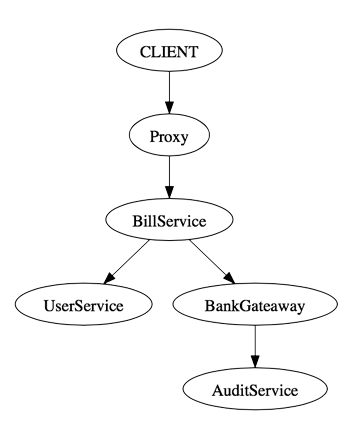
The DOT graph description language is used to create graphs in plain text, which can be visualized using tools like Graphviz. The language can be understood in few minutes which makes it easy to work with. Here an example
    digraph "/pay" {
      "CLIENT" -> "proxy"
      "Proxy" -> "BillService"
      "BillService" -> "UserService"
      "BillService" -> "BankGateaway"
      "BankGateaway" -> "AuditService"
    }
You can store this in a .dot or .gv file and open it with GraphViz.
Track request trees through chained IDs
As mentioned it is not possible to track a chain if there is only a unique ID per request, since one service can call multiple other services and do this even in parallel. Therefore we need three parts, a Unique Request ID, a Caller ID and a Receiver ID. For fast implementation I just modified the uniqueID to be in format
<FixedRequestId>::<LastCallerID>::<ReceiverId>A chain from the example above can now easily be parsed and printed in dot notation. The IDs from the example above would be the following:
Proxy           UID
BillService     UID::BillServiceID
UserService     UID::BillServiceID::UserServiceID
BankGateaway    UID::BillServiceID::BankGateawayID
AuditService    UID::BankGateawayID::AuditServiceID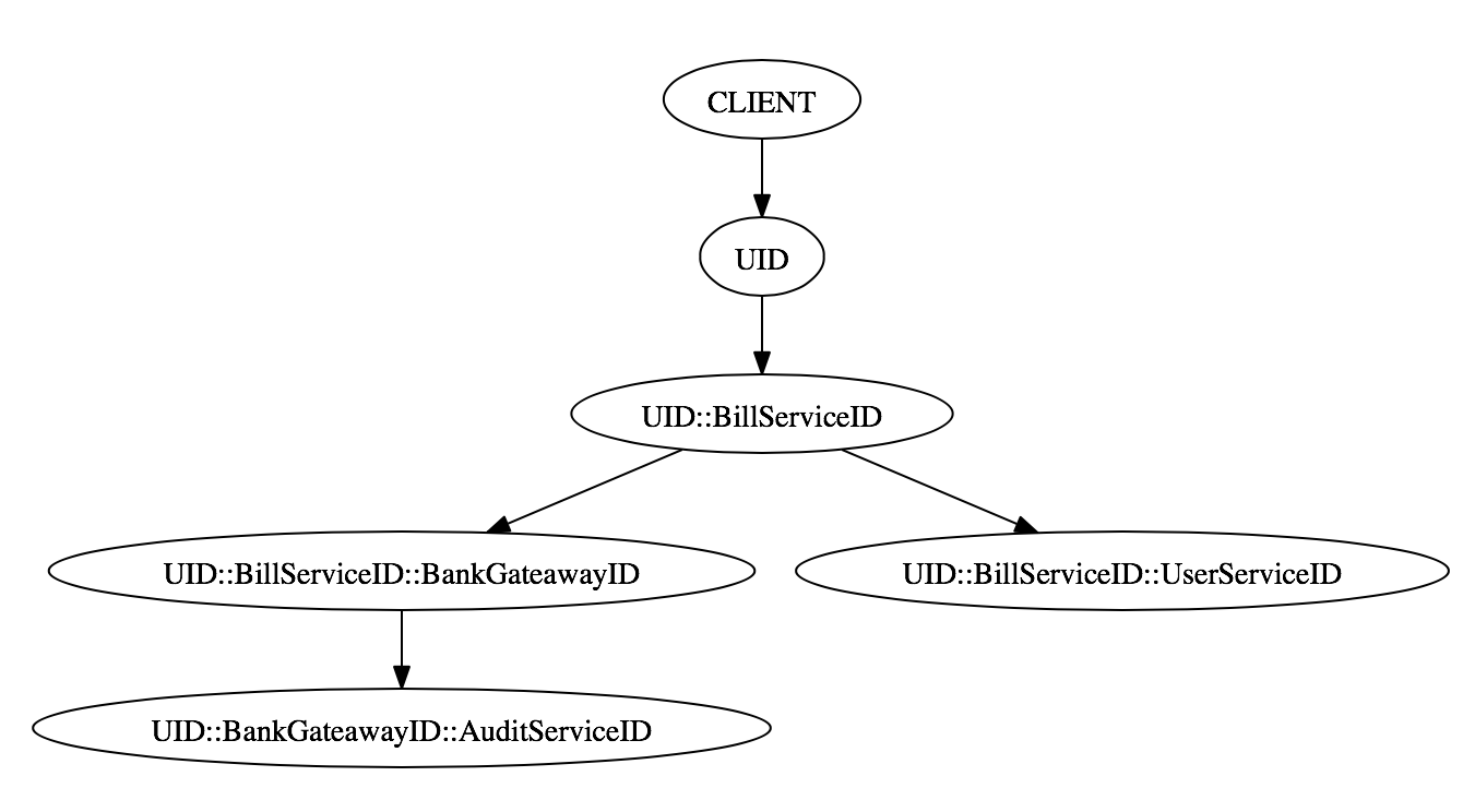
The go function to create this IDs is simple as
func transformUniqueId(parentUID string) string {
  ids := strings.Split(parentUID, "::")

  if len(uid) < 3 {
    return parentUID + "::" + getNextInstanceId()
  }

  return ids[0] + "::" + ids[2] + "::" + getNextInstanceId()
}
Since we use a beego filter to write the access logs, it is very easy to apply this to every incoming request. Parallel benchmarking shows that the additional cost of this is in range of 600-800 nanoseconds, including decomposition of the received ID, generation of the new ID and storing the result in the request context. The resulting ID will be sent in the header of every consecutive request to other services.
Parser implementation
After some logs have been produced, I wrote a parser for analysing these logs. A simple Golang interface represents a log entry:
type Log interface {
	// RequestUID returns the unique ID of the original request
	RequestID() string

	// String returns a string representation of the log
	String() string

	// SenderID returns the ID of the sender
	SenderID() string

	// ID returns the ID of this log. It is basically the ReceiverId
	ID() string
}

// Default implementation with functionality to parse chained IDs
type DefaultLog struct {
	data      map[string]interface{}
	requestID string
	senderID  string
	id        string
}
The parser basically just takes one entry, decomposes the unique id and creates an instance of DefaultLog. All the parsed logs are stored in a map or slice which can be iterated, sorted and filtered for analysis and graph creation.
Results of analysis
Here are three examples of results than can easily be produces with the parsed logs:
1. Request tree and elapsed time
By changing the String() method, the desired information can easily be printed into dot notation. In this example I executed a request and printed elapsed time per service. This is sort of profiling on system level. The graphic shows which service takes how much time in a clean way.
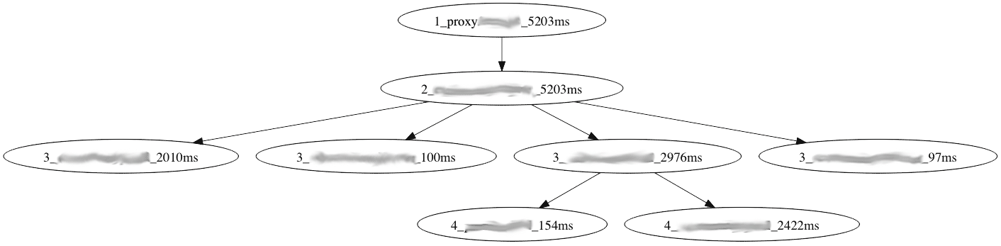 (numbers do not represent real environment times)
2. Request number between services
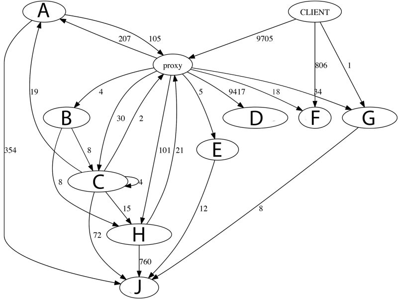
This graphic shows system wide calls. It is created over a certain time period and shows absolute numbers of total requests. Please note, one node is one service, not one running instance. We can make the following interpretations
- Service A, C and H call other services through proxy. This is unnecessary and should be corrected.
- Service C calls itself, these calls should be refactored to method calls.
- Service D is called most by far. This calls are very cheap and caused by a temporary solution. Therefore it can be ignored.
- Service F is called directly, the system would be cleaner if we can redirect those calls through the proxy.
3. Outgoing requests per incoming requests Example:
6.5322833   ServiceA
2.5714285   ServiceB
0.99878484  Proxy
0           mailer
This ratio can show some flaw in the services. Some may have a high number because they basically aggregate data from other services, but they should be investigated. Also it can be seen that Proxy is almost but not exactly 1. This 0.0013 difference are invalid requests which the proxy couldn’t resolve and responded with “service not found”. A similar statistic can be made per endpoint.